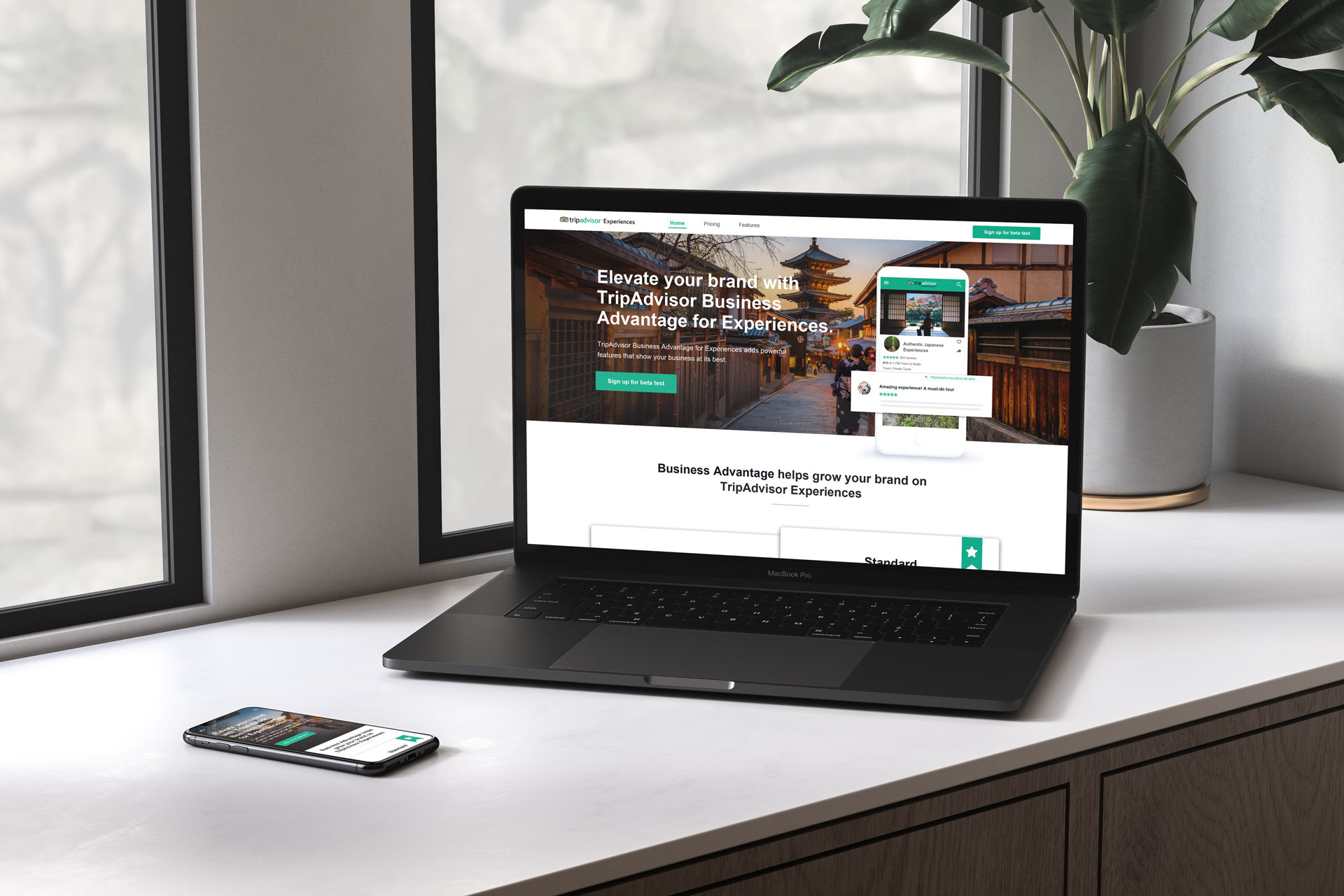
Tripadvisor Experiences Business Advantage programme
Overview
The base of suppliers signed up in Tripadvisor Experiences was very vast and kept growing very quickly, but only a small percentage of the overall suppliers with claimed listings had live products. On top of that, only the top rated products accounted for most of the bookings, which meant that there were a lot of products that were not being monetized.
The opportunity: Sell enhanced features
Based on the user research we did, there was an appetite from non-bookable suppliers that they’d be willing to pay for enhanced Tripadvisor listing features.
In addition to that, most of the competitors and marketplaces/ecommerce sites have premium offerings, so we should be able to play in that field too.
Researching the competitors
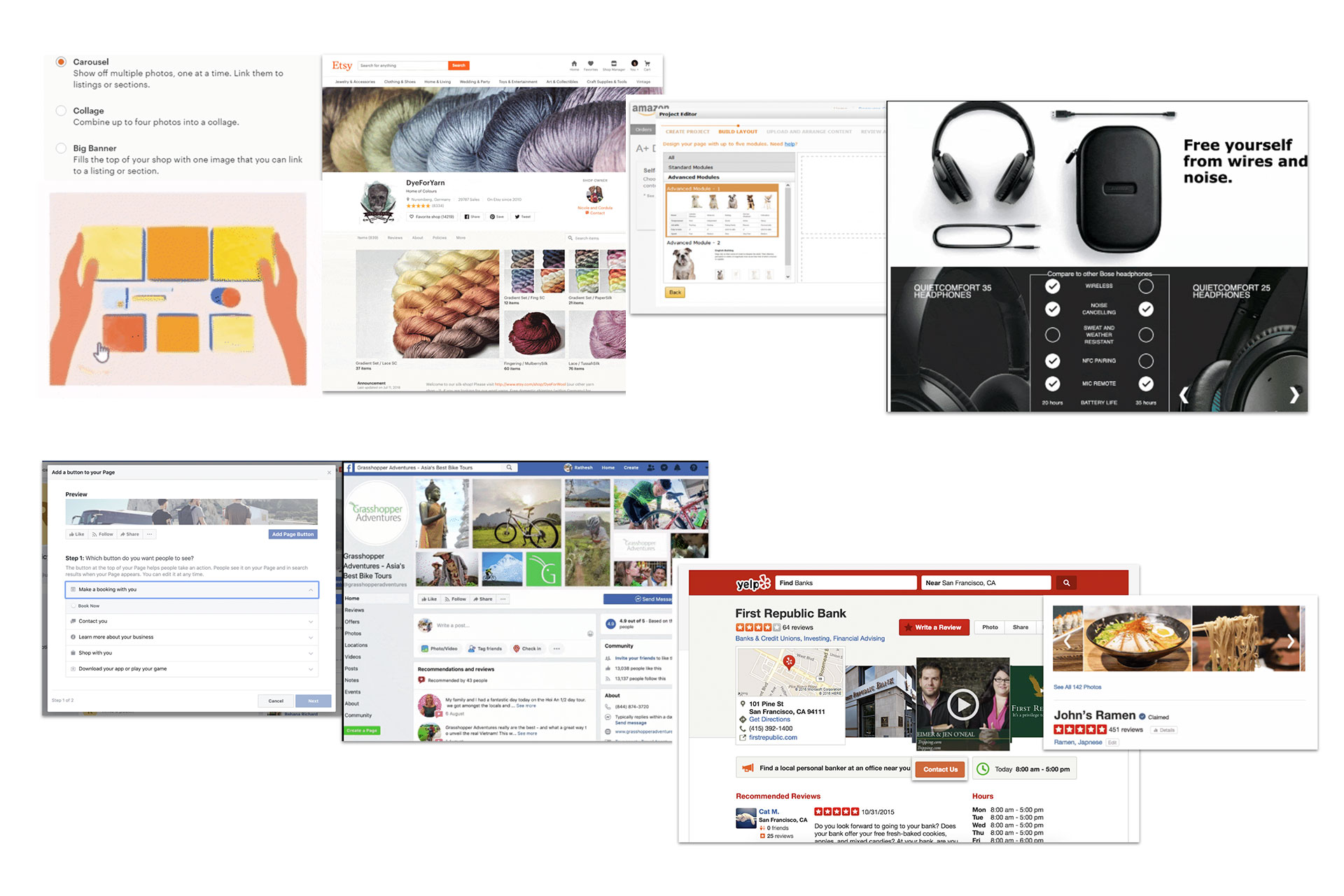
Business Listing competitors concentrate on getting the information across and facilitate channels for communication.
They provide a sense of reputation in the special treatment they do on the information architecture of the pages: different layouts to standard listings, carousels, enhanced profiles, special features, rich images, advanced customizations, etc.
The Process
I partnered with a UX Researcher to get some insights into best practices for pricing tables usability and UI preferences, as well as more psychological insights into the preferences of users while addressing pricing tables.
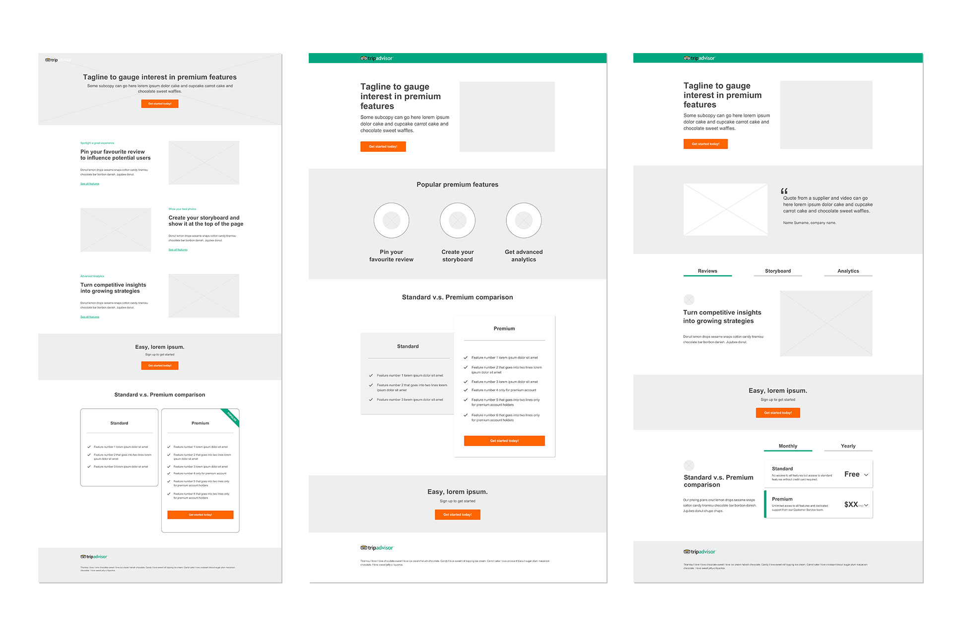
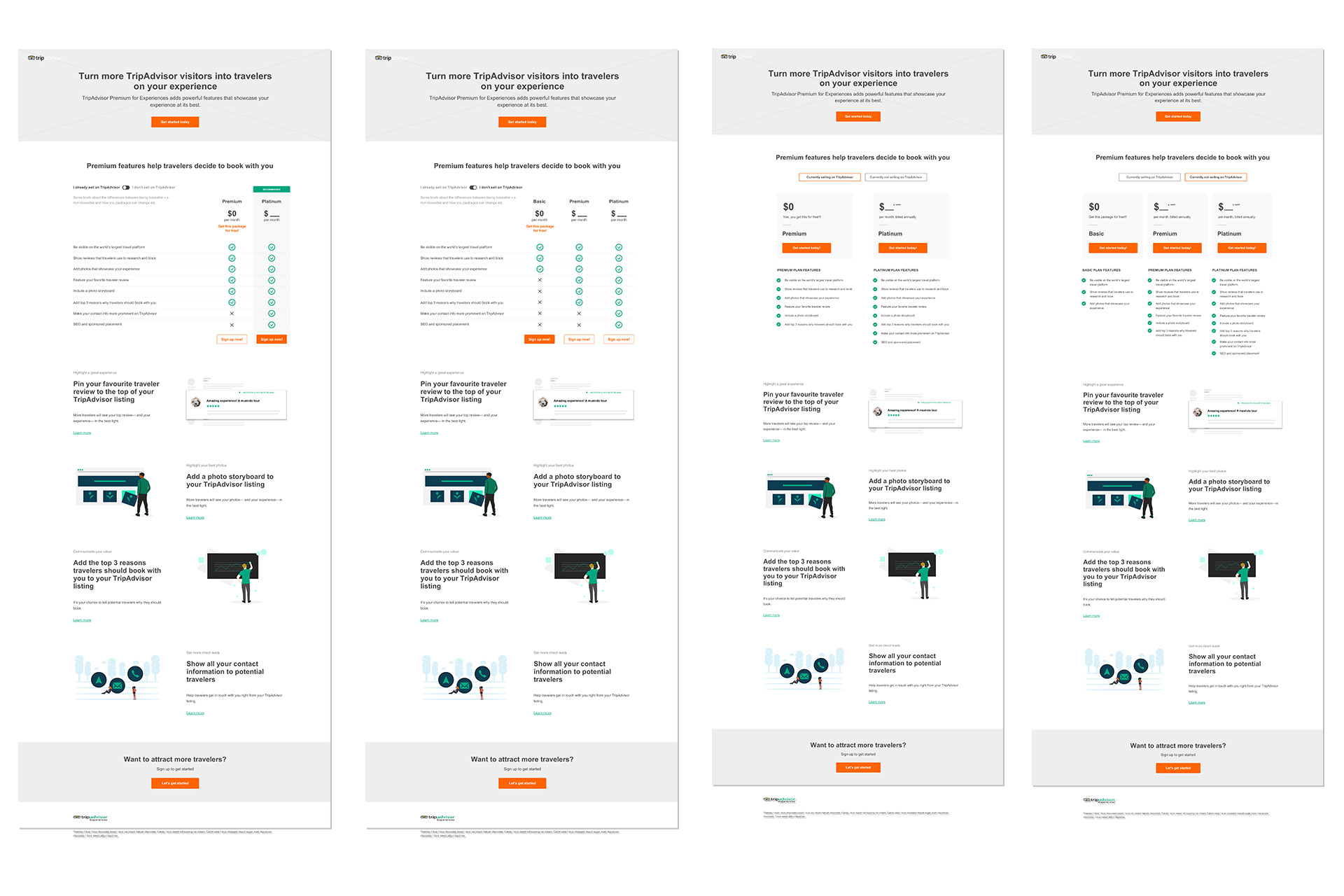
I created several wireframes and prototypes with different styles and amounts of items/columns in them to see what seemed to convert better. This was a very iterative process.
Once a prototype that was put to test gave us the results we were expecting in conversion, I translated those insights into final pixel-perfect prototypes and worked with the developer to make all components and interactions as designed.
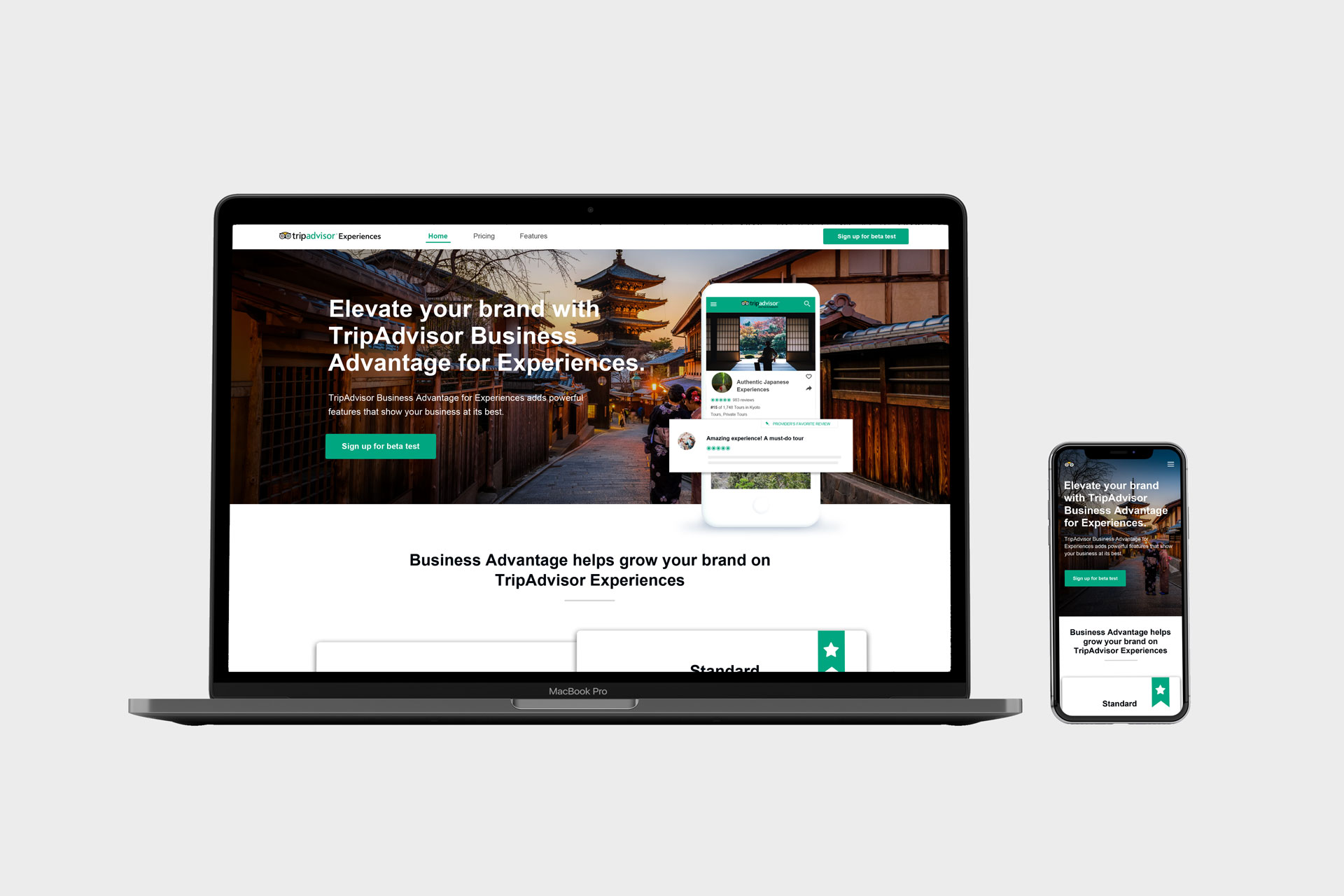
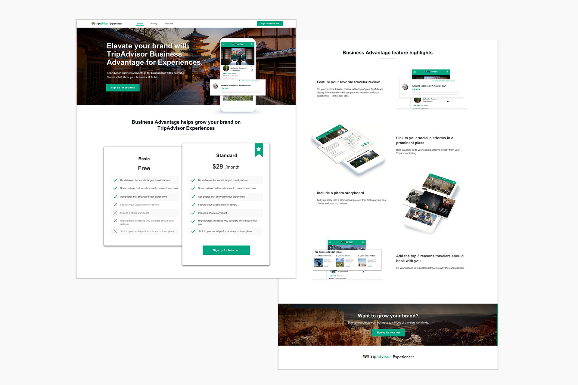
Solution
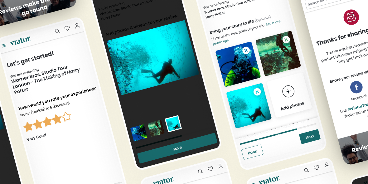
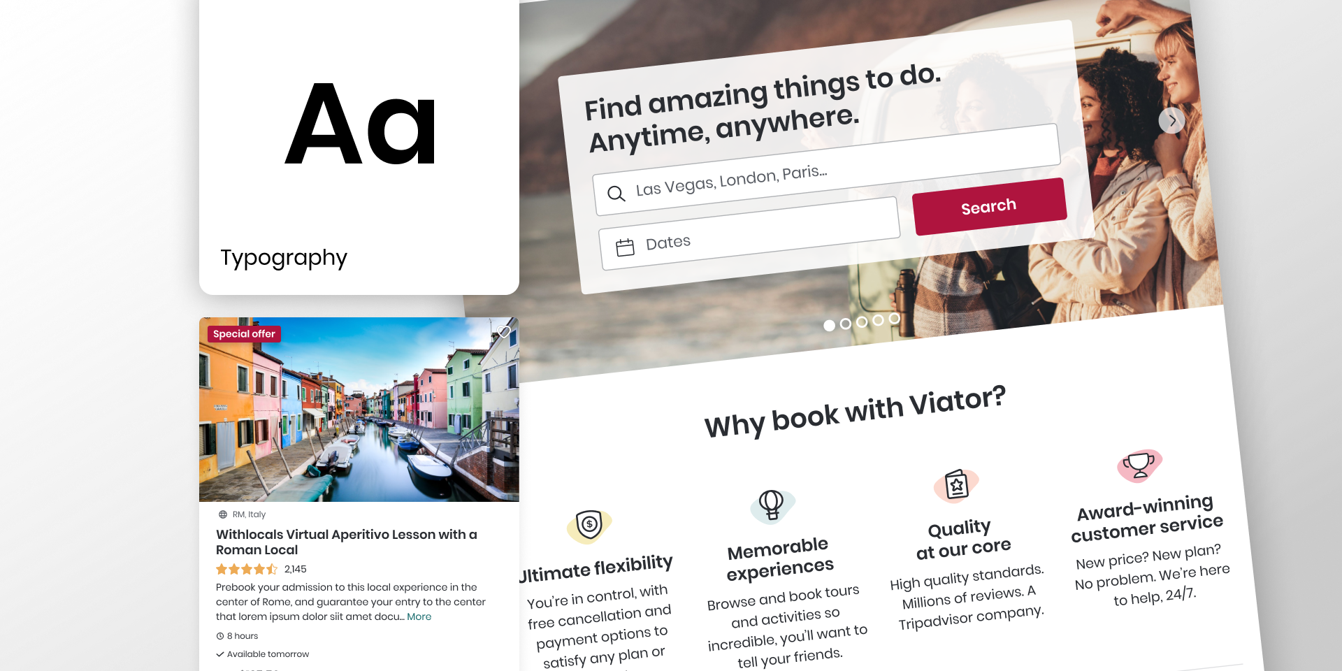
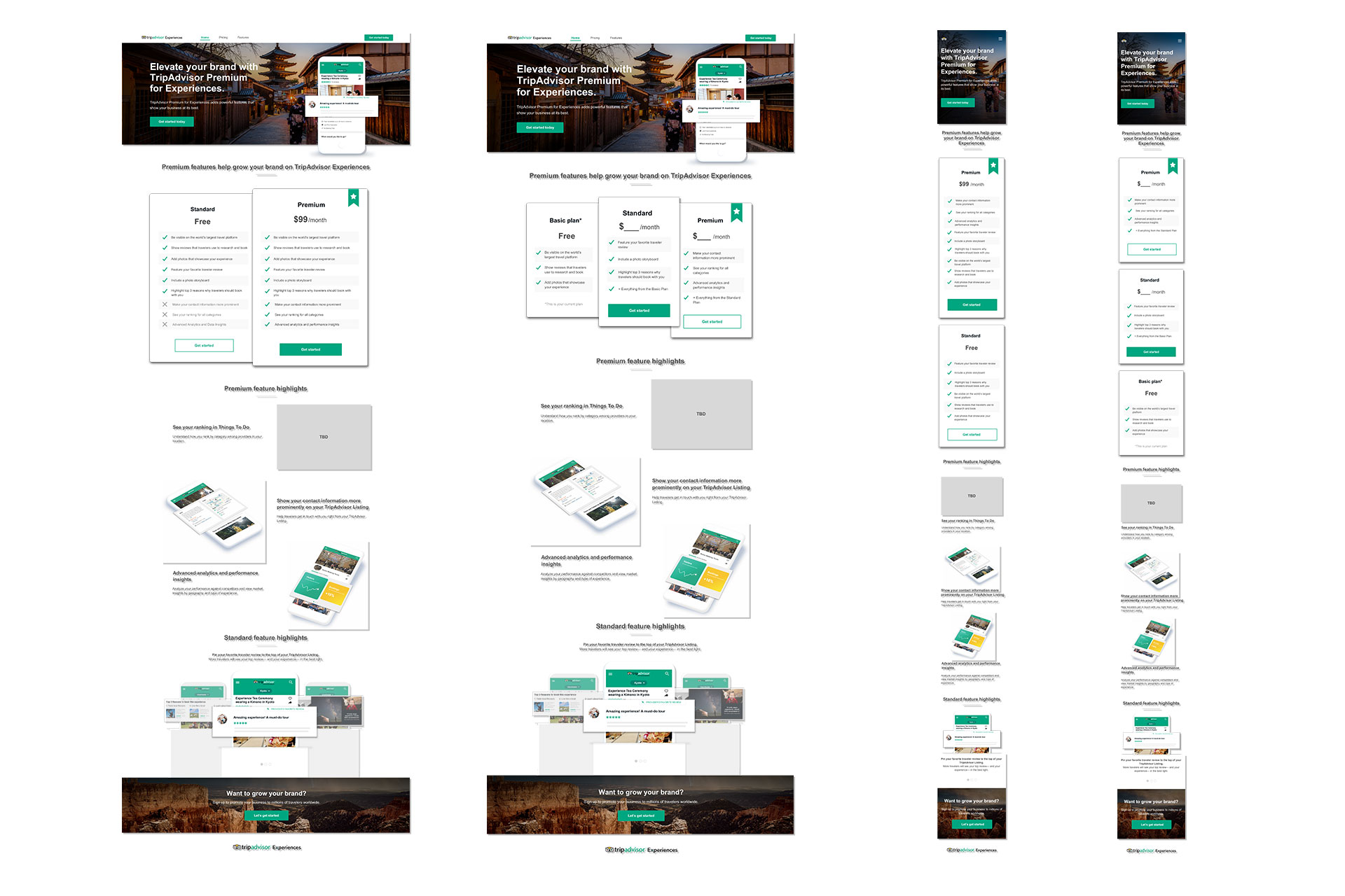
The sales page was a responsive design so it was optimised for desktop and mobile. It featured 3 main sections: hero image and message with CTA to sign up, the pricing table with the two pricing options, and the explanation of the main features with mockups for each of them.
Once the designs for the landers were ready I collaborated with the software engineer to handover the styles and guidelines and QA’d the beta tests.
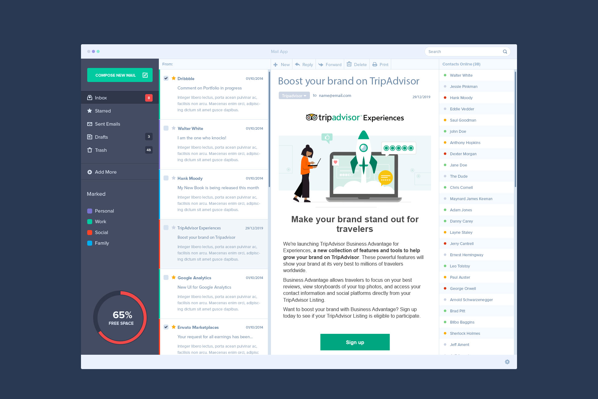
At the same time, I worked on the CRM email campaign that was sent to users informing them of this new feature. This involved the creation of the email, design of the hero illustration in branded color palette and style and the collaboration with the CRM team in order to make sure we had all the pages created so users could sign up from the email.