Design System for Viator
Overview
Viator as brand didn't have a design system in place, so I was responsible for building and managing its creation from scratch in Figma to make sure we had a single source of truth and improved handoff between designers and developers.
The problem
When I first started working with the Viator brand I realised all designers were working off their own versions of a style guide or components library. This led to inefficiencies in development work, discrepancies in UX and UI among the product, and lack of clarity on the brand for new team members within different functions in the organization.
The Process
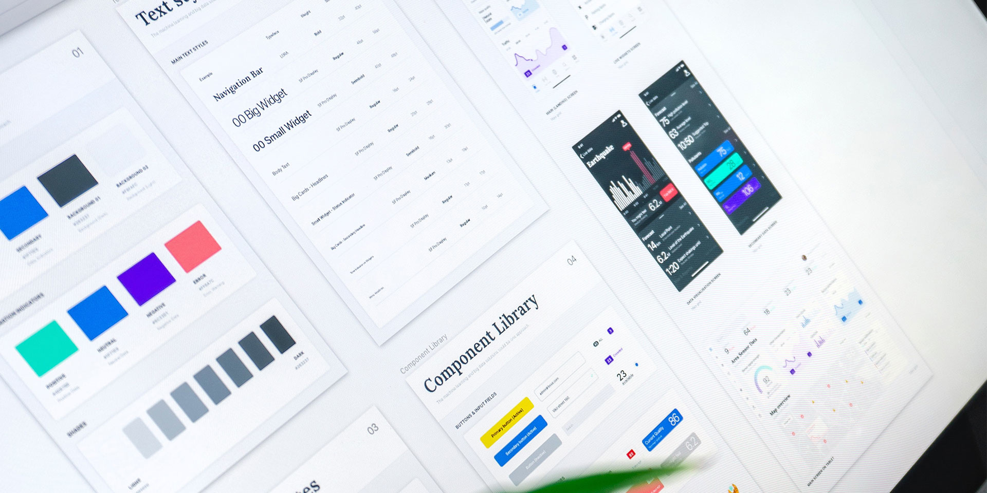
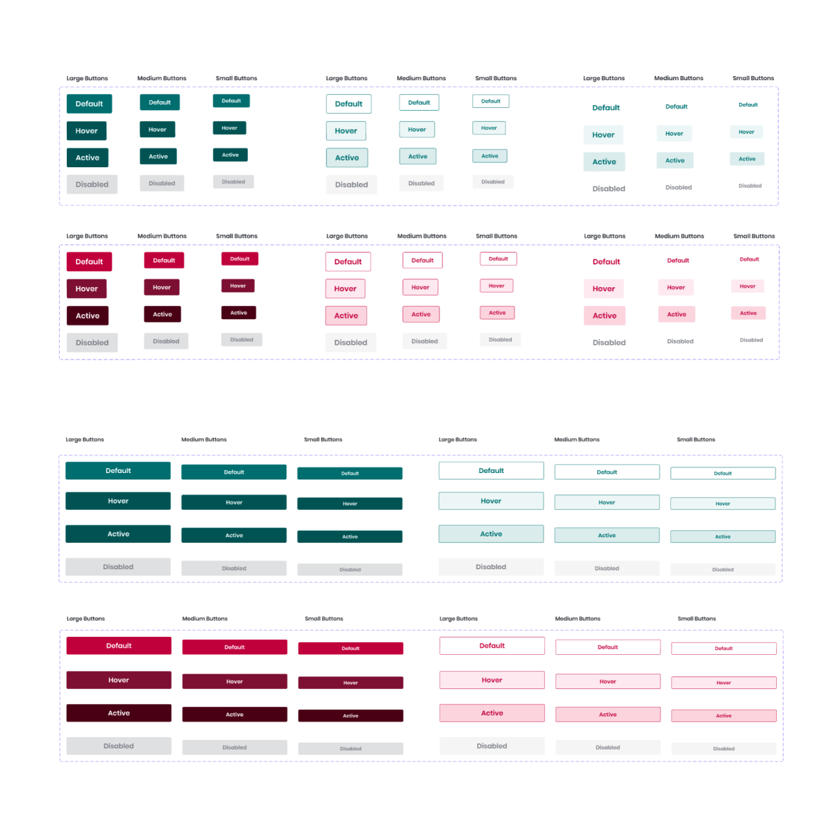
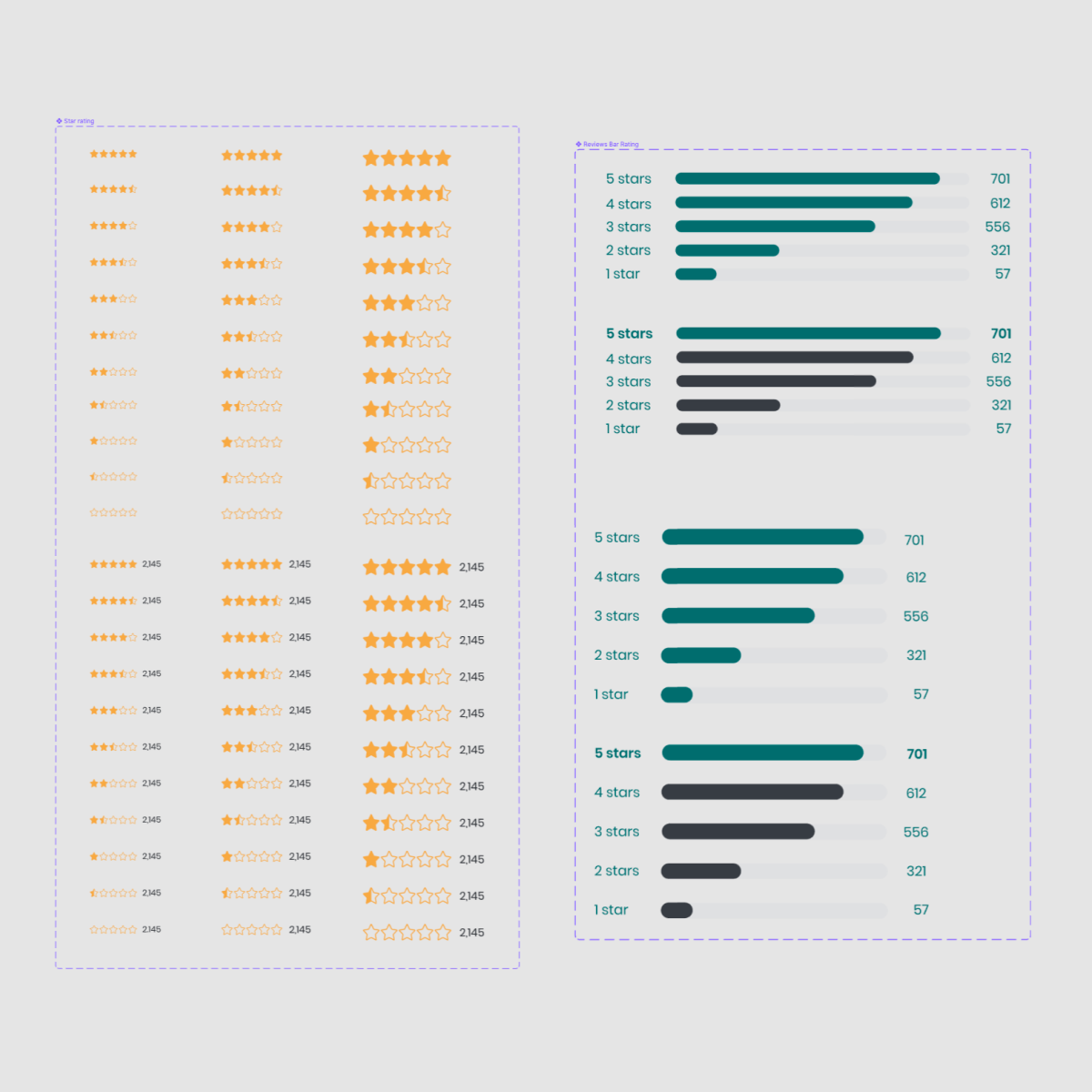
Basing all the workflow in the concepts of atomic design, I started by creating the design tokens that will be used in all the components: Grid, Text Styles, Colour Palette and Spacing. I made them the common styles for the Design System library and are fullyI available for the rest of the team to use.
After the styles were created, I started working on every single component that builds the library to a pixel-perfect spec and applied the shared styles on top of them (so if a style needs to change in the future all components will be automatically updated).
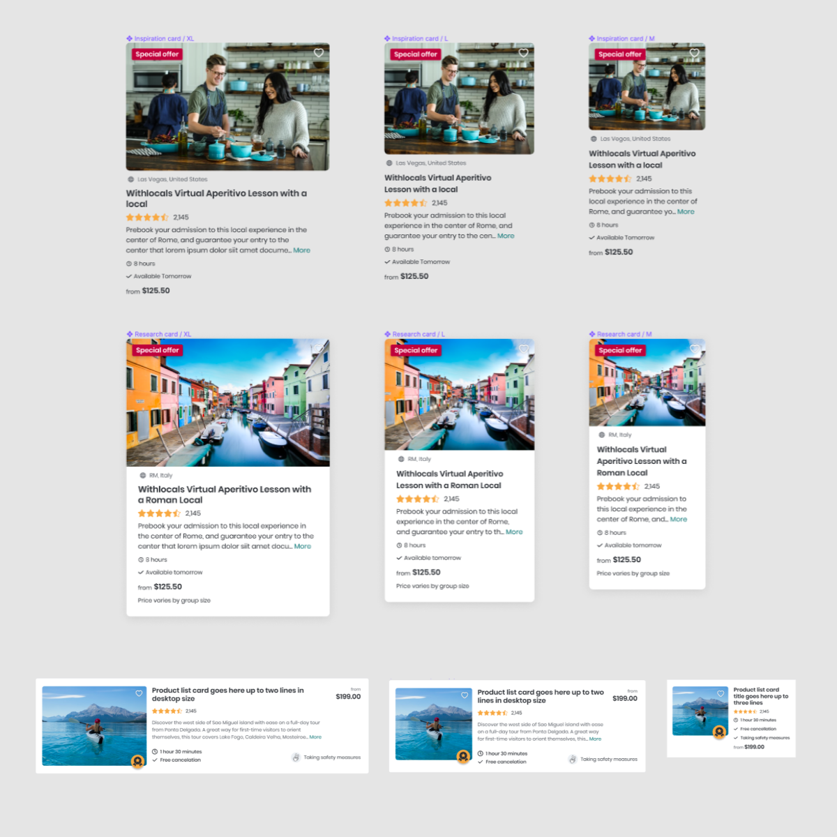
The library is divided in Primitives, Elements and Templates. I firstly started creating all the primitives in a way that will be easily transferred to code (utilising at its maximum the amazing features Figma offers, like Auto-layout, Variants, etc.). This makes collaboration between engineering and design much more efficient and engineers can inspect the code of each component.
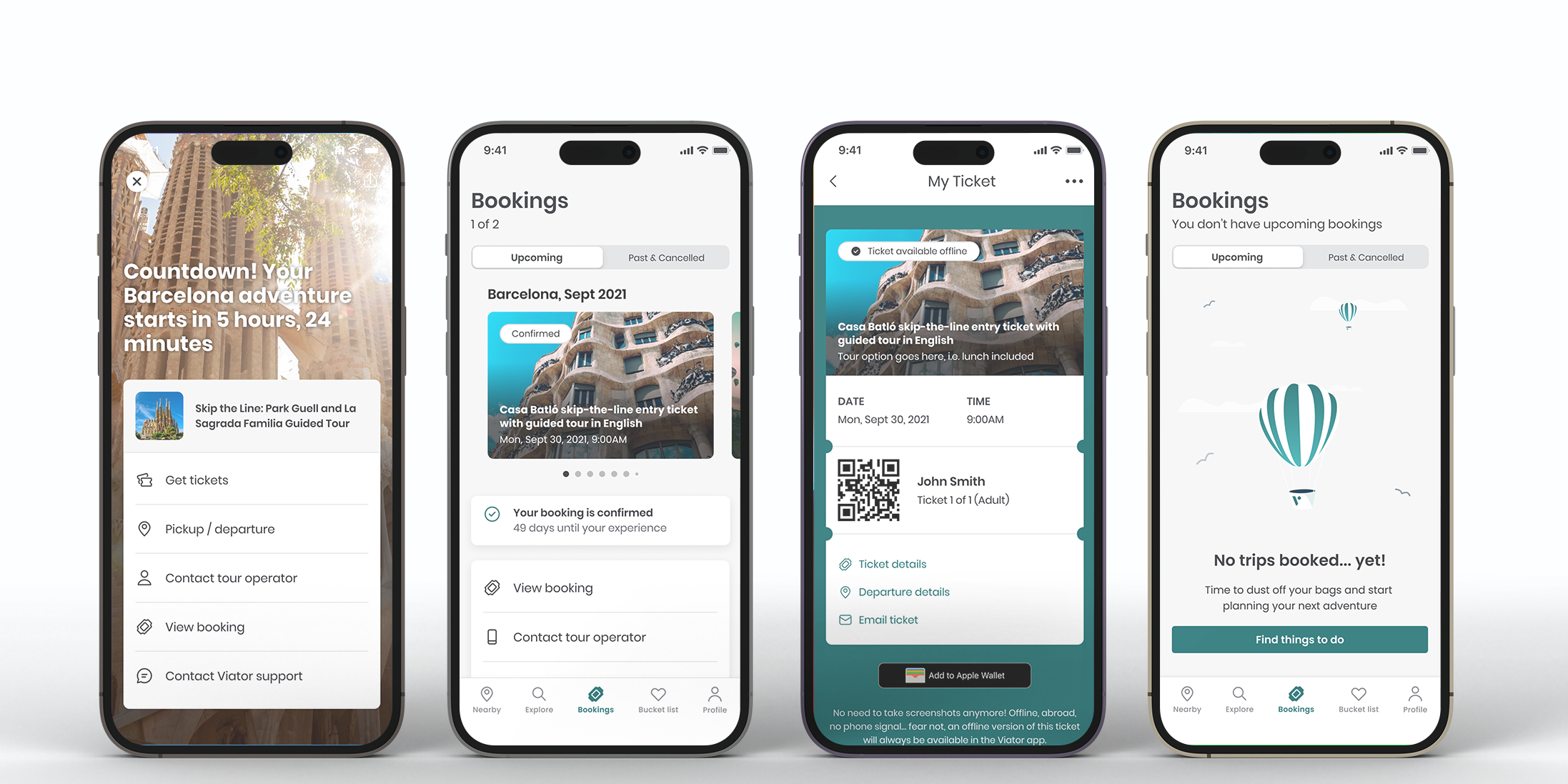
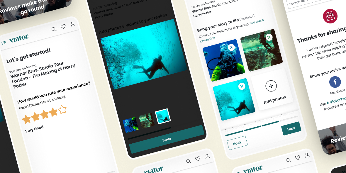
Once the primitives are ready, I moved on to create elements (which are made up of multiple primitives), and created them as individual components as well.
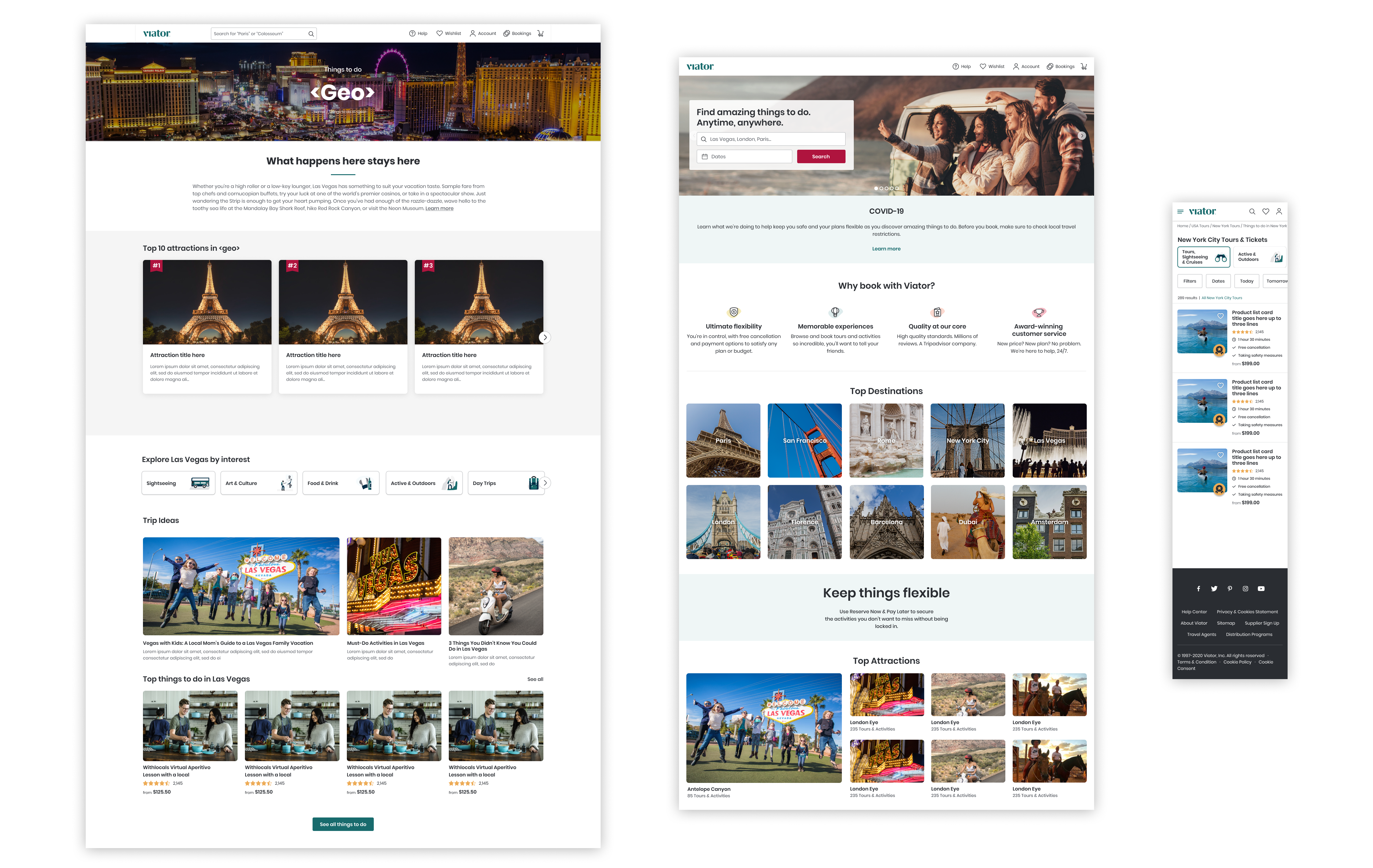
And lastly, the design templates, which are complete pages of the product utilising all primitives and elements in conjunction. This is particularly useful for new designers joining the team as they can see how it all plays together.
Apart from the master design system library, I’ve introduced a couple of complimentary libraries for our icons and illustrations, as they don’t need to be treated as React components.
Solution
A comprehensive Design System that not only displays style guide or components library, but also helps deliver efficiencies among product, design and development teams across the organization, enhancing the customer experience and improving the go-to-market speed of any new features.
The Shared Library is accessible by any team member, where they can find all the components and styles divided into their individual pages.
All components are responsive and have been built using the latest features Figma provides: variants, auto-layout, etc.
The Design System is the source of truth for both engineers and designers, and the documentation included in the design system complements the technical documentation included in Storybook.