Design System for Tripadvisor Experiences
Overview
As the design team shifted from using Sketch to Figma, there was the need to design and build a consistent design system in the new tool so that all components were consistent, adaptative, pixel-perfect, responsive and available to be used by developers and new designers joining the Tripadvisor Experiences team.
The problem
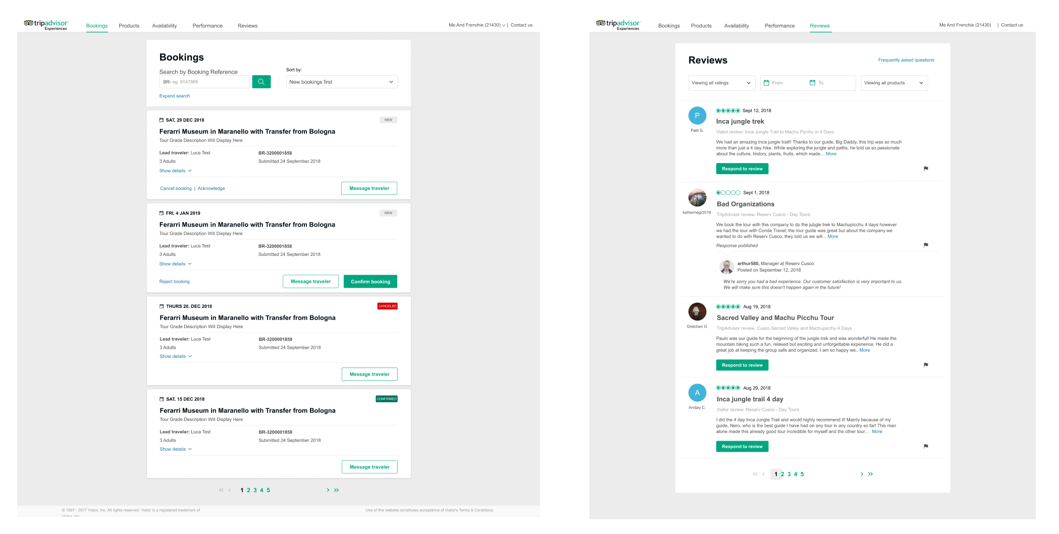
The previous design system made with Craft (by InVision) was not built to spec and a lot of the components and screens changed since they were added to the library, so the whole design system became dated. As part of the creation of a new design system in Figma I will also undertake the update of all components to the real specs in production, as well as making the library of components customizable with the minimum number of actions, so the properties are propagated to elements, meaning that if you change something there it will update everywhere.
The Process
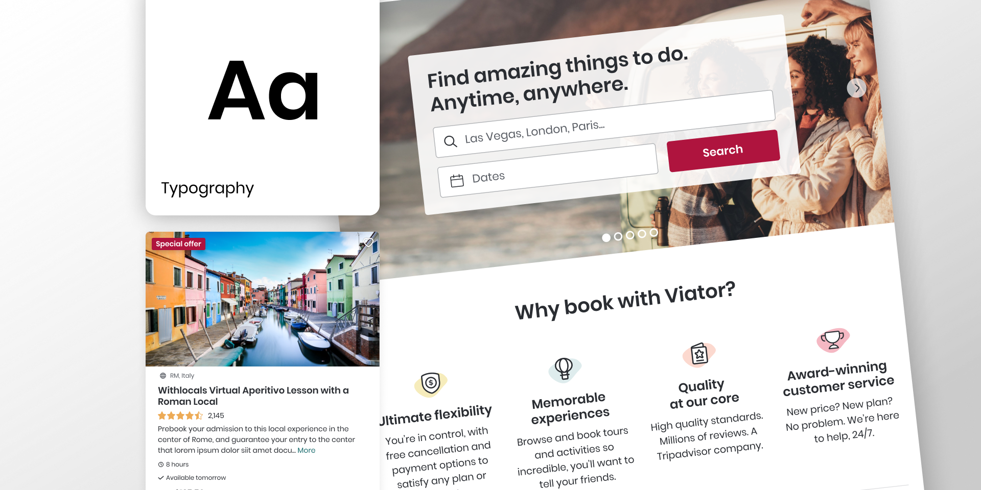
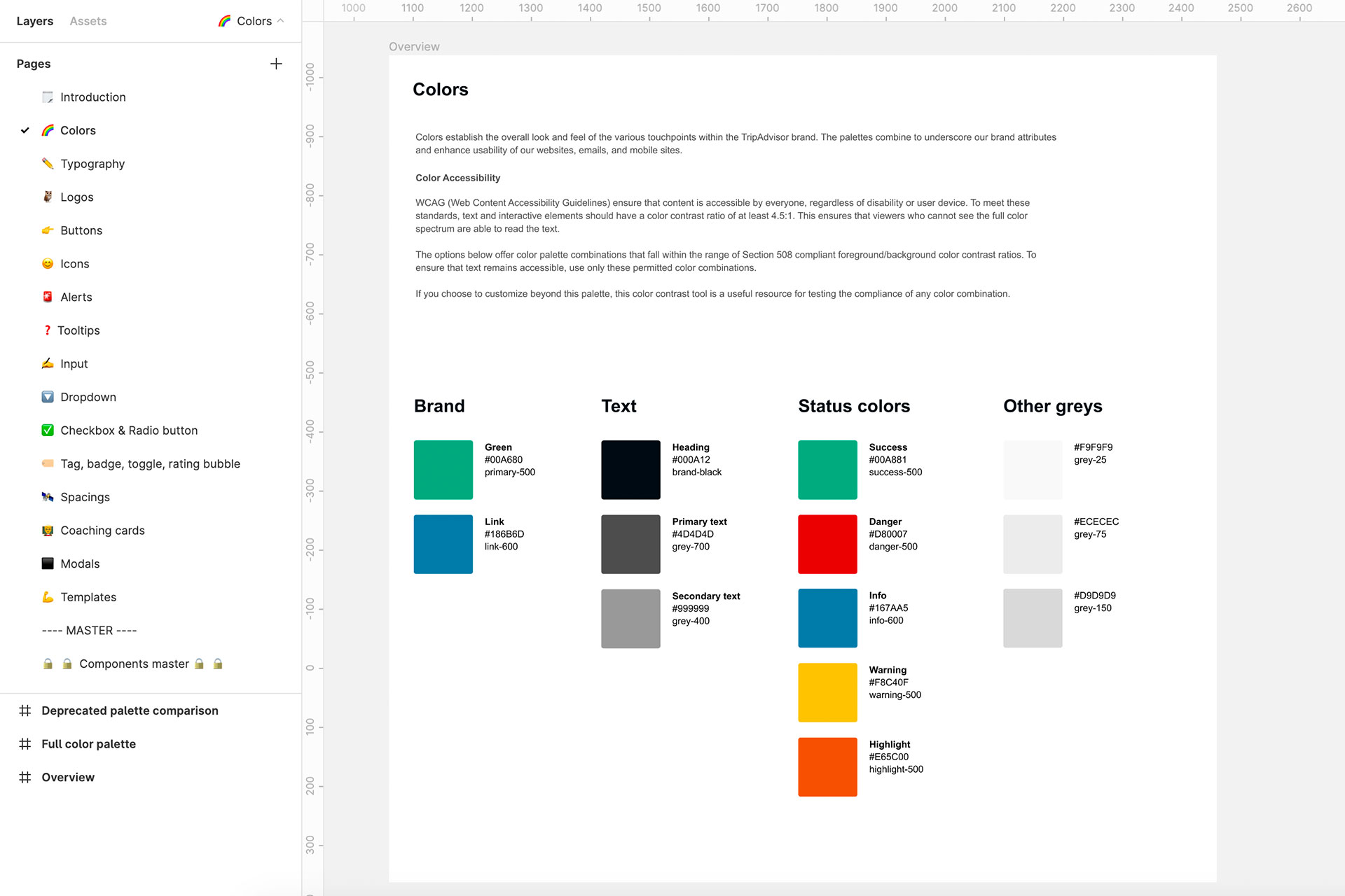
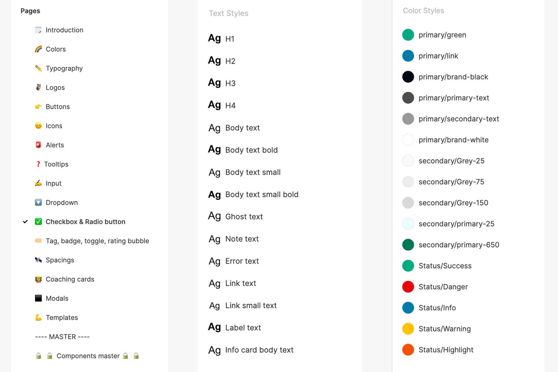
Basing all the workflow in the concepts of atomic design, I started by creating the common styles that will be applied to all components: Typography and Colour Palette. I converted them into the standards for the library and made them available for the rest of the team to use.
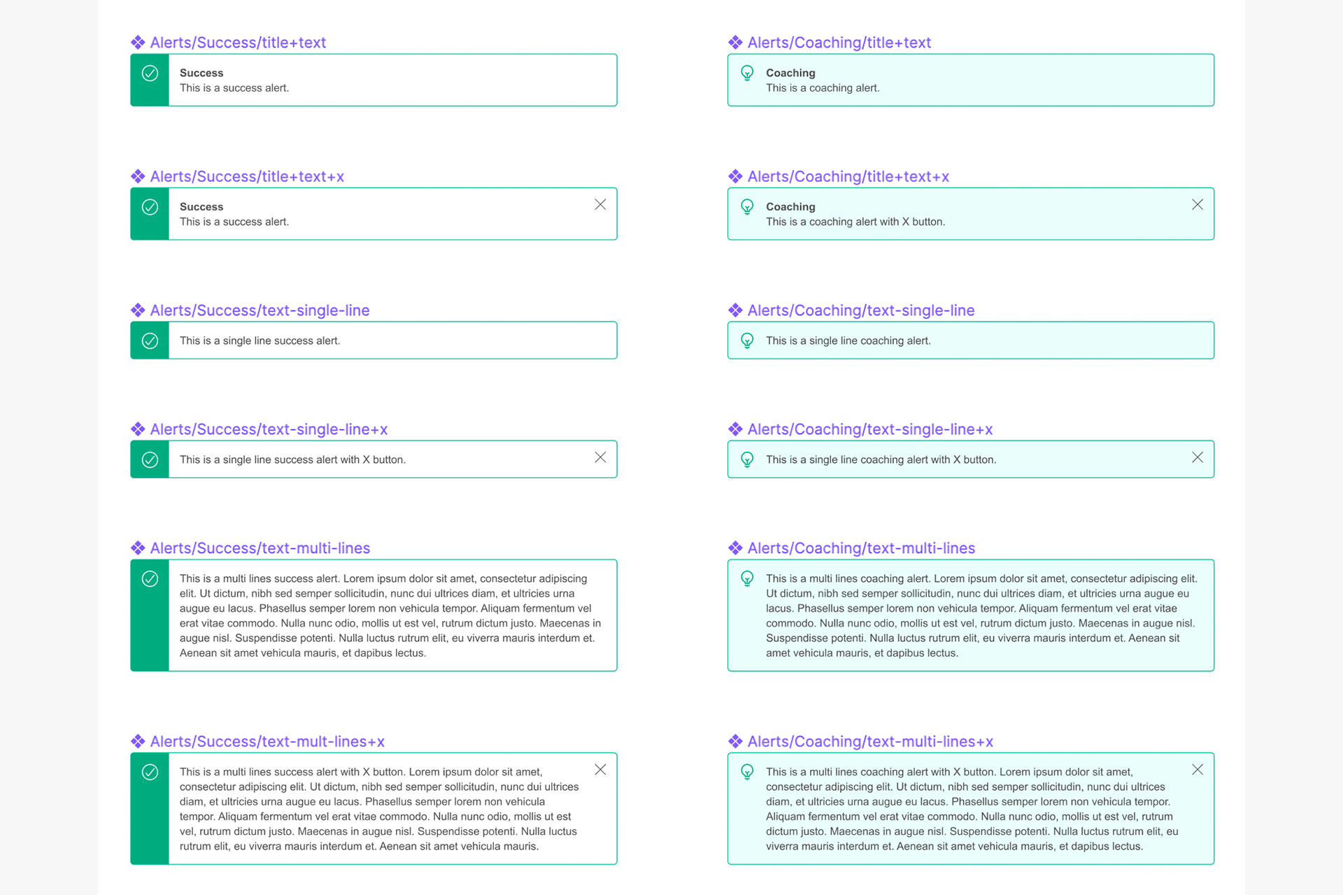
After the styles were created, I designed every single component that builds the library to a pixel-perfect spec and applied the shared styles on top of them (so if a style needs to change in the future all components will be automatically updated).
Last but not least, I created a master page with all the master components.
Solution
I provided the team with a Shared Library where they can find all the components and styles, as well as a Master File where all the master components are saved.
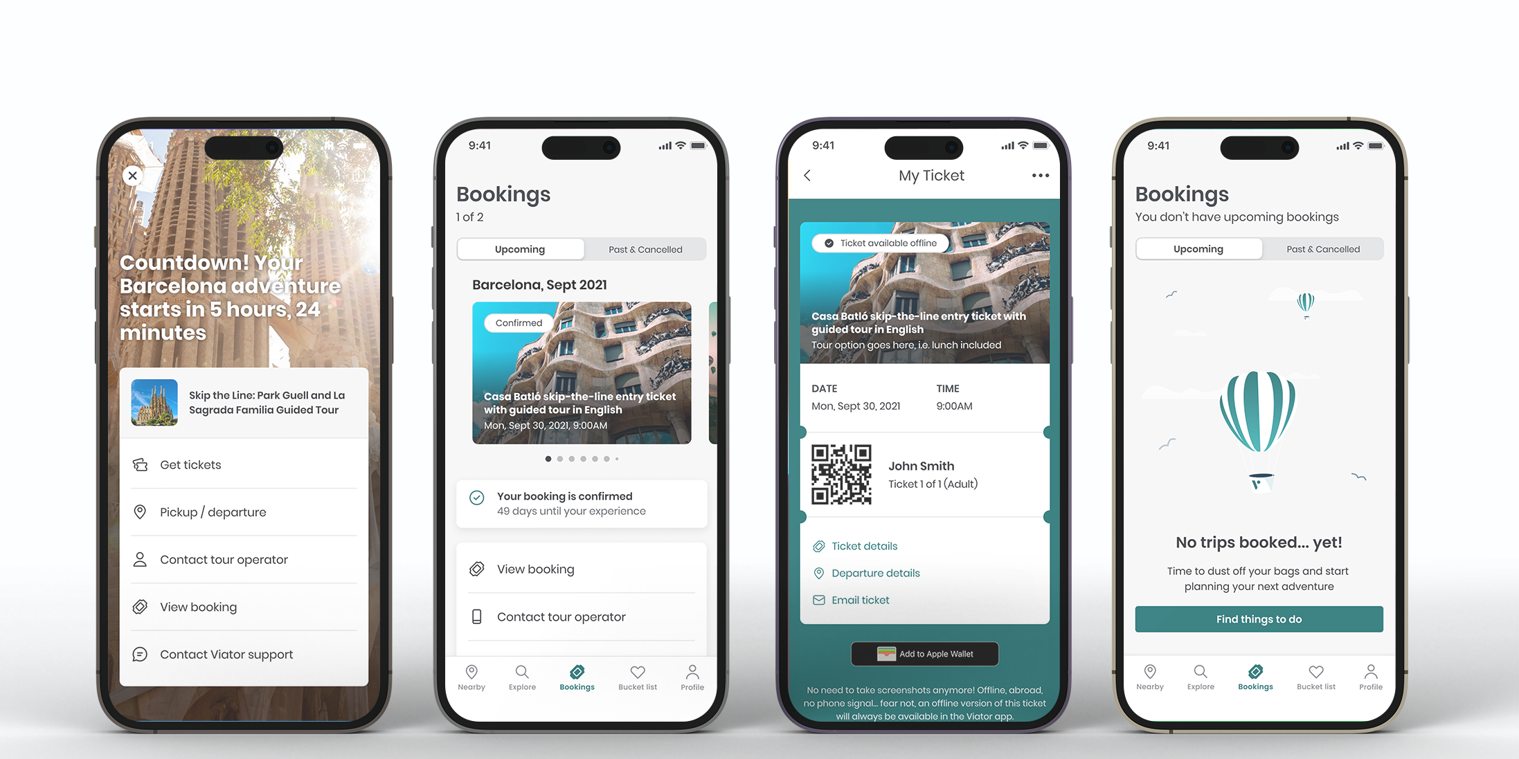
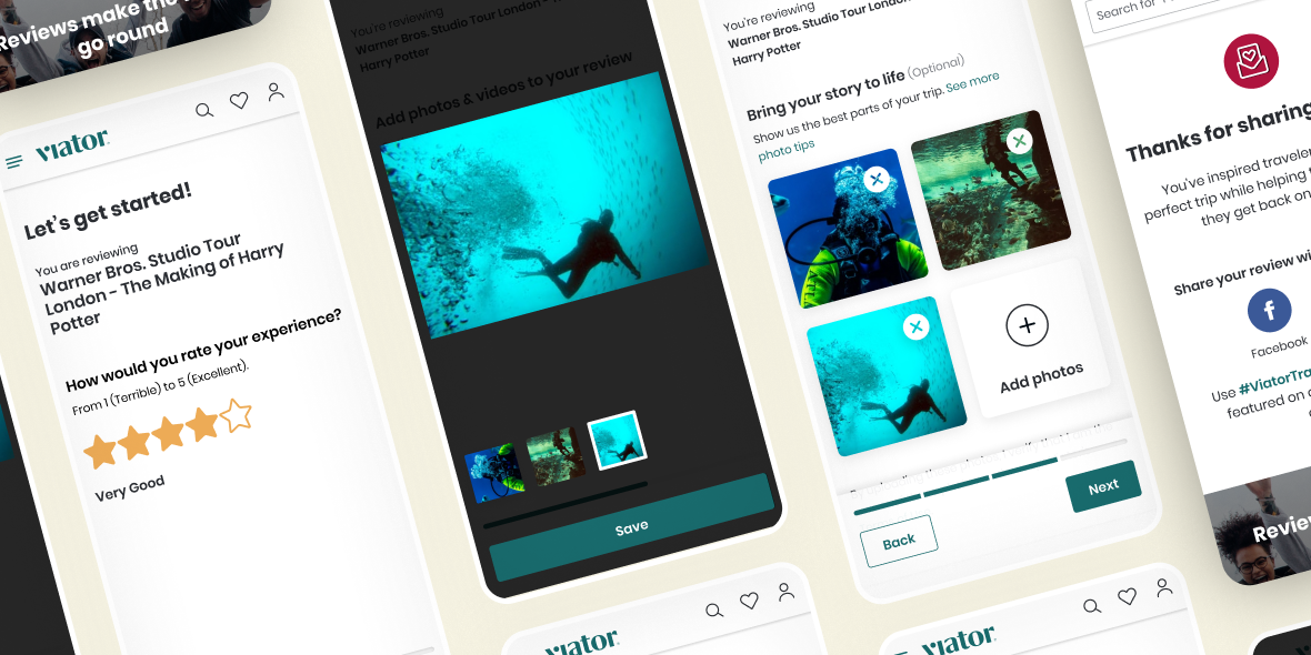
This master file contains a page per type of component (i.e. checkboxes, radio buttons, alerts, typography, etc.) as well as desktop and mobile templates ready to be used of the most common pages.
This allows any designer of the team, anywhere in the world, to produce consistent work and helps on handing over the work to development as the components match the engineering style guides.