Seeds Iceland New Brand Identity
Overview
Seeds Iceland is an Icelandic non-governmental, non-profit volunteer organisation designed to promote intercultural understanding, environmental protection and awareness through work on environmental, social and cultural projects within Iceland.
As a commemoration of their 10th anniversary they decided to revisit their brand identity to revamp it and make it more modern.
The opportunity: Defining a new brand identity for an Icelandic environmental non-profit organization to better reflect their work
Since its foundation, the organization had kept the same visual identity, including logo and color palette.
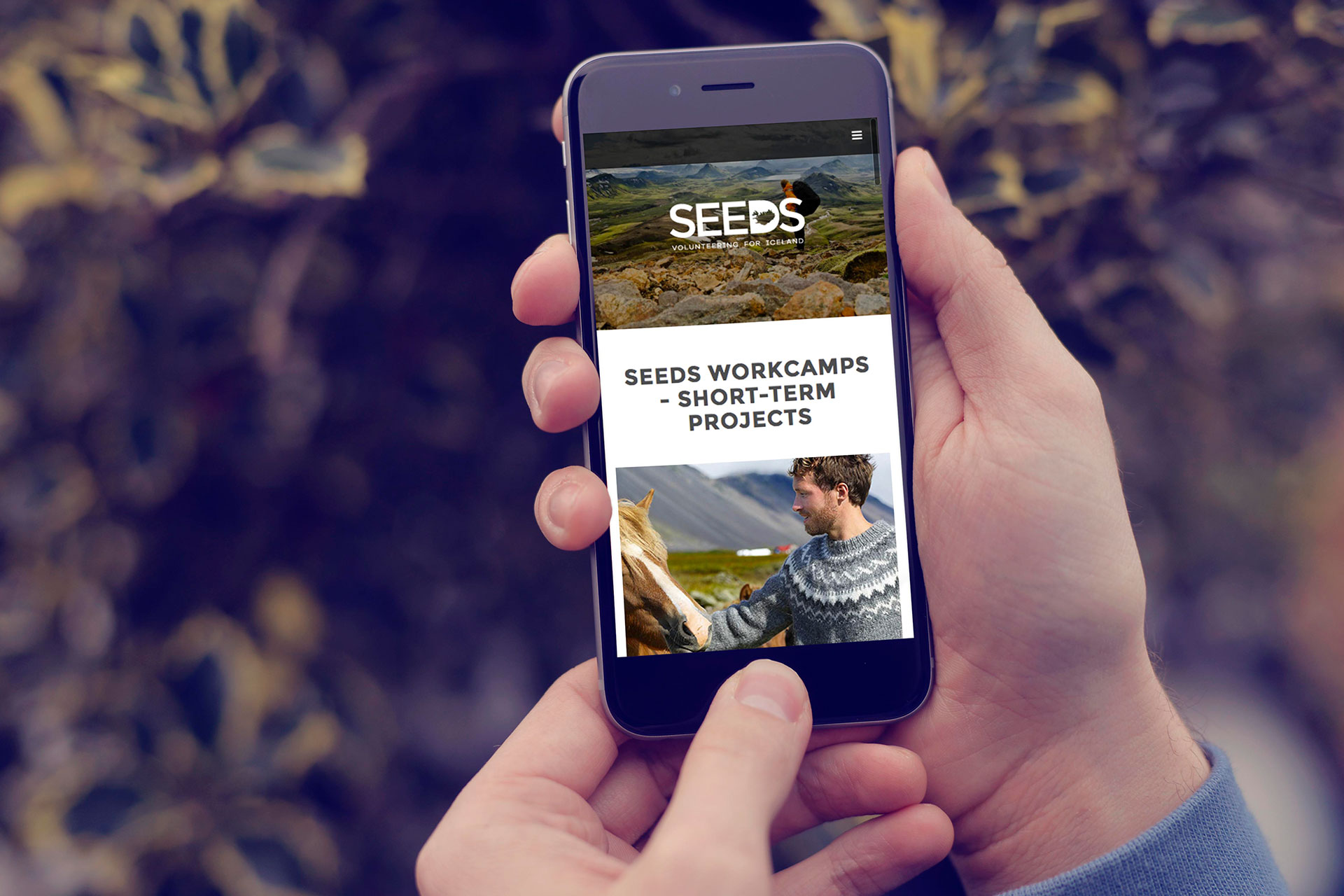
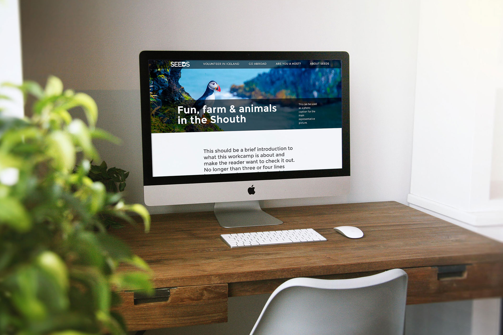
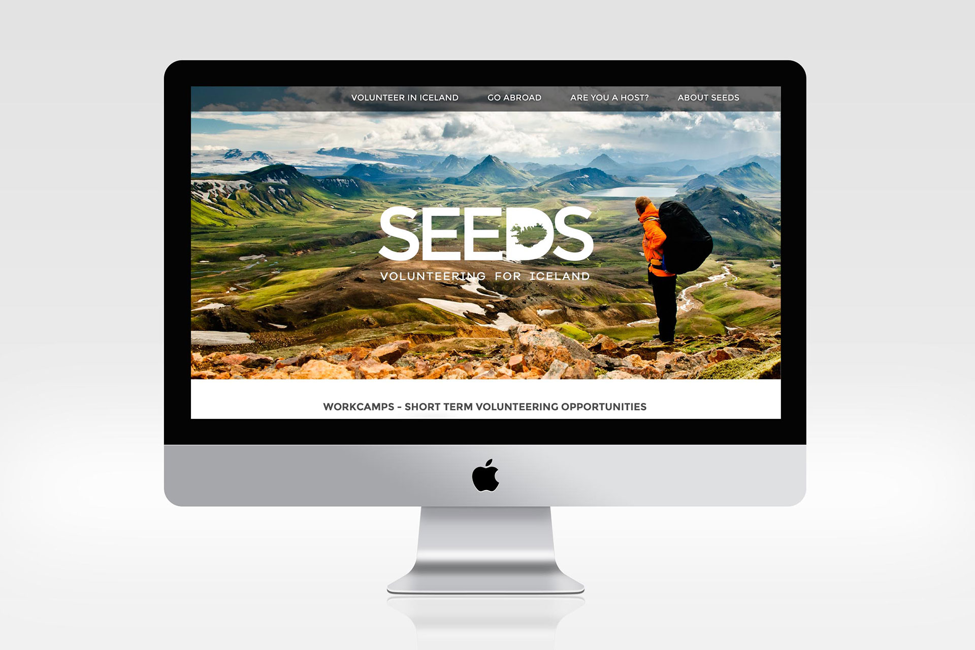
Their website also needed a revamp as it was not responsive, and considering their target users are young people from all over the world that needed to be urgently addressed.
The Process
I started by conceptualizing the brand in a set of different logo variations and worked with the client in order to refine and choose the one that was more representative of what Seeds Iceland was.
Once I defined the idea, I designed the logo and worked on creating a color palette that was exciting, young and based on the wonderful Icelandic landscapes colors; I also defined the typography for the new brand, making sure the type chosen contained all the Icelandic characters.
Once the logo, palette and colors were defined, I moved onto defining the photographic style and defined some guidelines to make sure all their photography looks consistent.
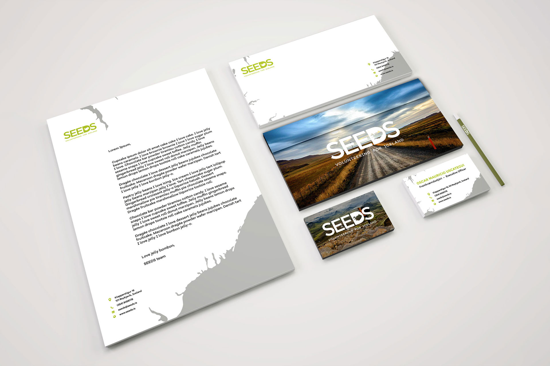
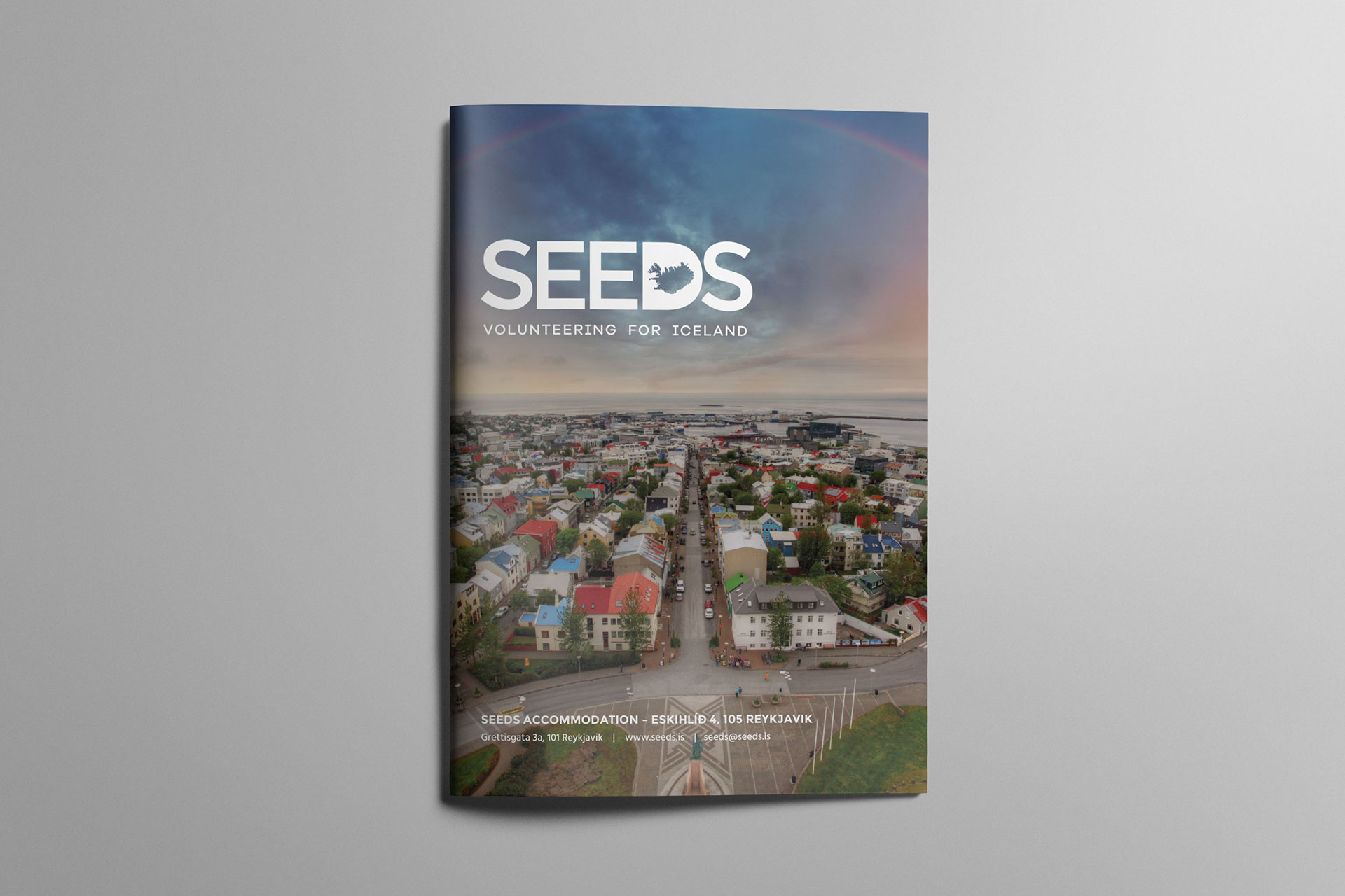
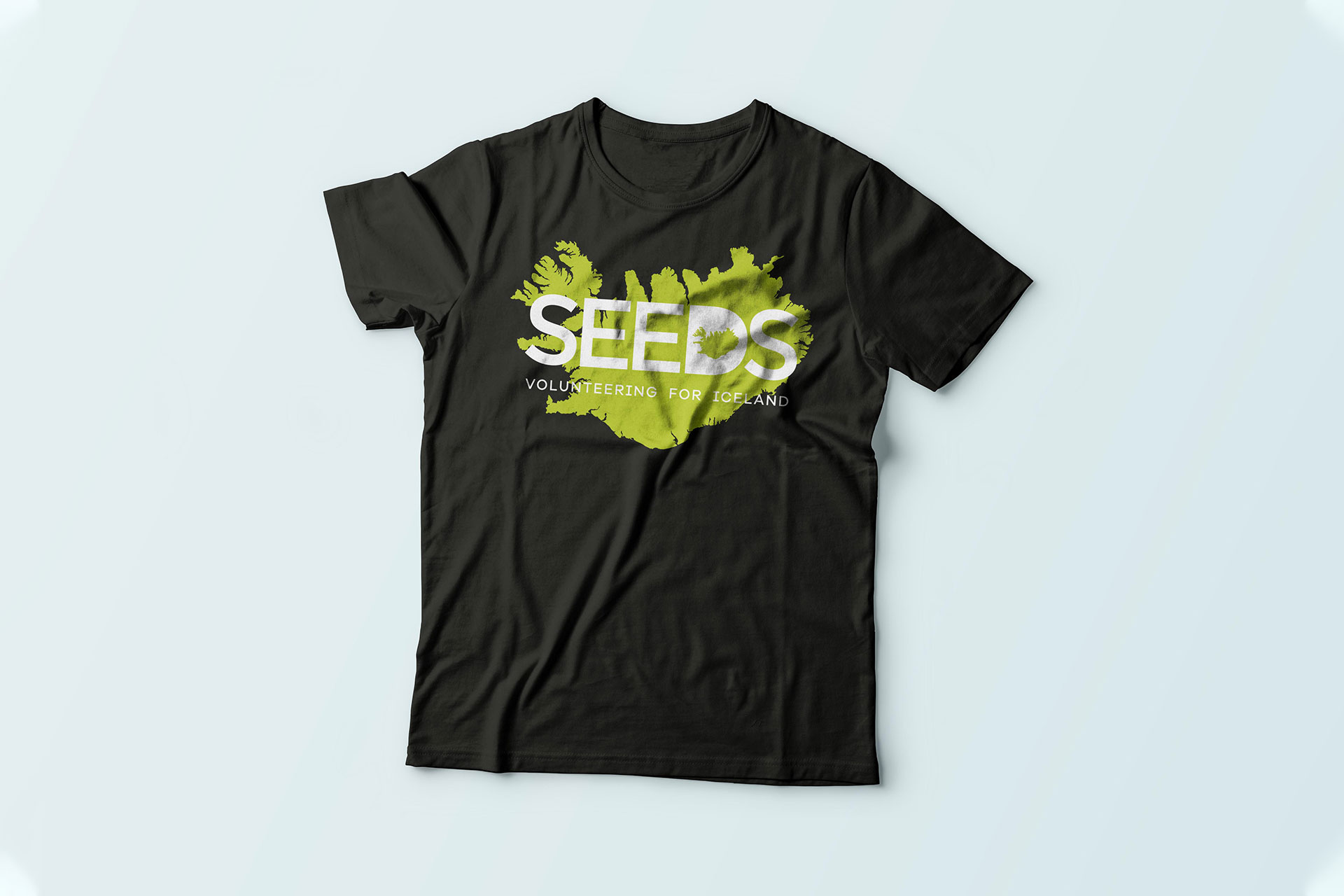
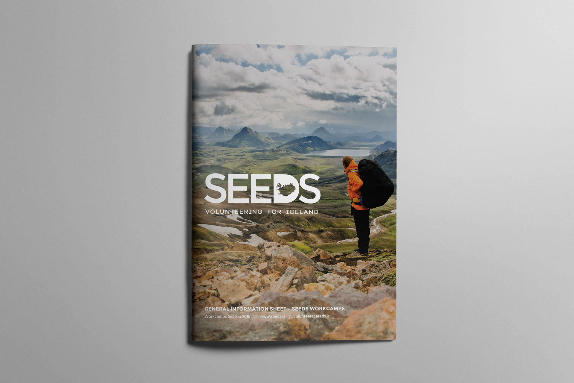
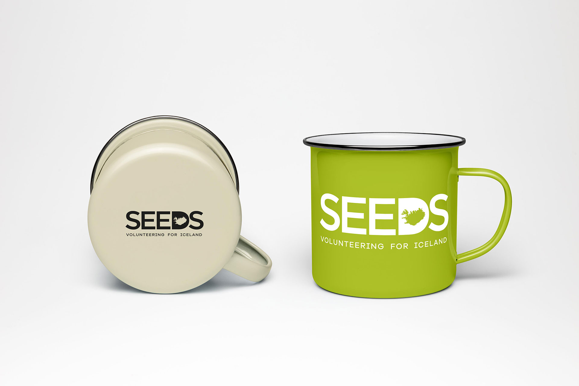
Then it was time to get deep into the print world: I designed all the layouts for the print materials and collateral they requested: brochures, postcards, social media graphics, vinyl stickers for their minivans, clothing, merchandise, etc.
Last but not least, it was time to design from scratch their website. I wanted to make sure photography was very prominent as the Icelandic landscapes are one of the presentation cards of the company and something that drives people from around the world to join the workcamps Seeds Iceland offers.
The end result
The new visual identity was very fresh, energetic and young. It was inspired by the amazing Icelandic landscapes and it invited people to travel and try to be part of the environmental projects they do.
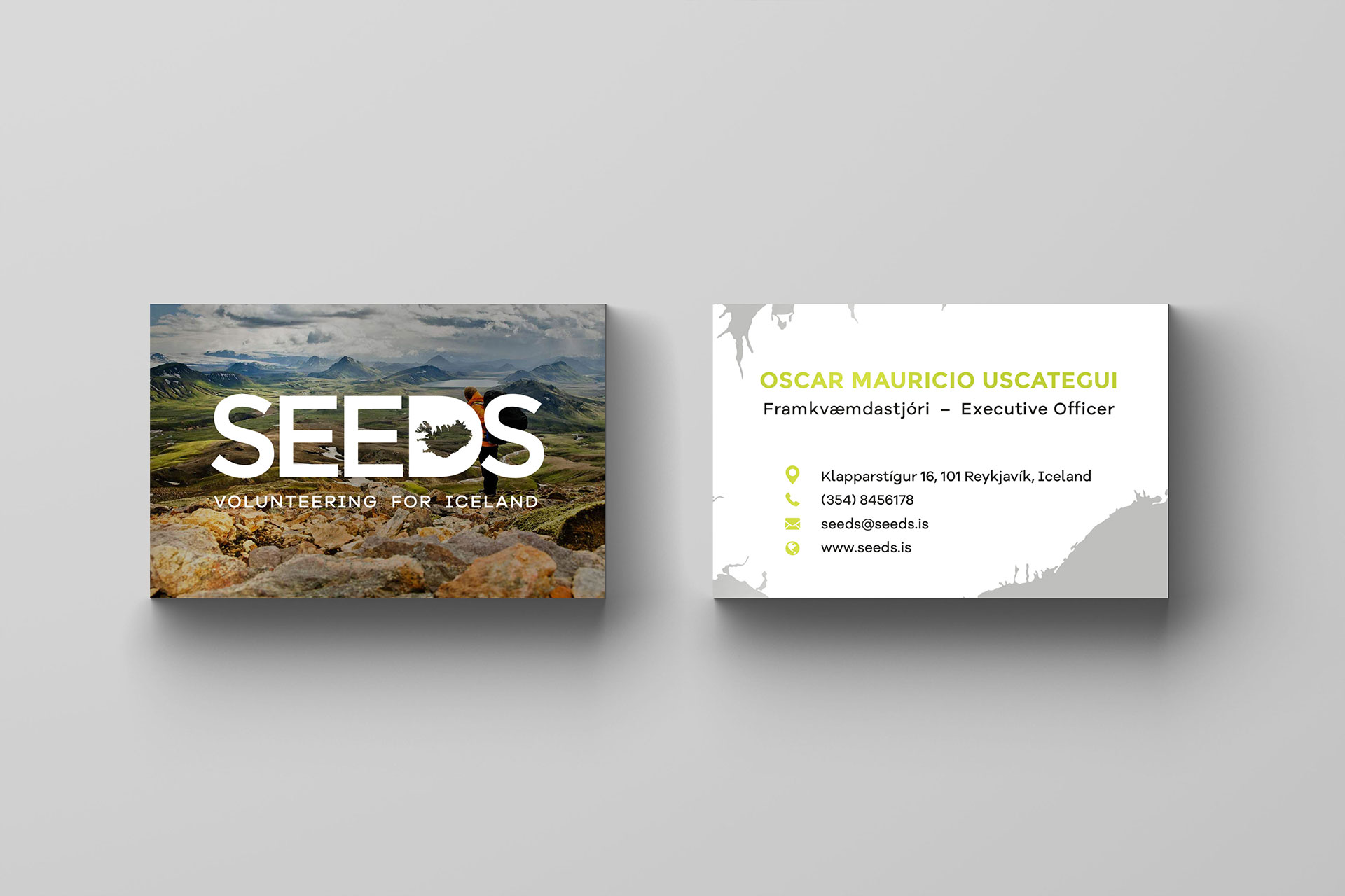
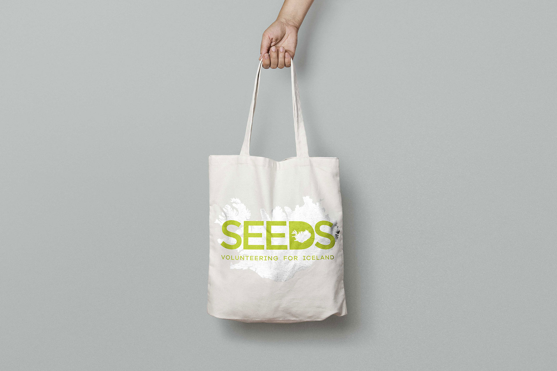
The shape of the island was used in the D of the logo as it's a very recognisable shape, as well as in some stationary to create texture.
Key Features
Branding & Visual Identity
Logo Design
Seeds Iceland New Brand Identity
To celebrate the 10th anniversary of this non-profit volunteer organisation, Seeds Iceland commissioned my job to design a new brand identity that will appear across all their communication materials: from a new logo to informative brochures, dossiers, flyers, posters, merchandise, clothing, car livery, etc.
Client NameSeeds IcelandYear2015Linkwww.seeds.is
